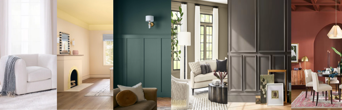
During the fall season, paint companies release their predictions of colors that they think will be in demand in the upcoming year. For 2026, colors trends are leaning towards calming, earthy, and nature-inspired tones. Neutrals like Sherwin-Williams' Universal Khaki, Pantone's Cloud Dancer, and Dutch Boy Paints’ Melodious Ivory reflect rest and simplicity, while greens, blues & earthy tones like Valspar's Warm Eucalyptus, AkzoNobel’s Rhythm of Blues palette, and Behr's Hidden Gem show a need for connection and comfort in the home.
Neutrals
Pantone, the global provider of professional color language standards and digital solutions for the design community, has introduced Cloud Dancer as the company's Color of the Year 2026.
Sherwin-Williams names Universal Khaki as its 2026 Color of the Year. The color was selected by the Sherwin-William’s Global Trendsight Team to be an ultra-usable hue, inspired by enduring elegance and rejuvenating resilience.
Dutch Boy Paints announces Melodious Ivory as its 2026 Color of the Year. The company states that this neutral color speaks to a cultural shift toward simplicity, authenticity, and intentional living—qualities that are shaping the way homeowners design and experience their spaces.
Greens, blues, & earthy tones
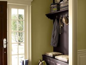
Benjamin Moore, a paint, color and coatings leader, has revealed an alluring mix of rich espresso hues with subtle notes of charcoal - Silhouette AF-655 . Balancing refinement and distinction, Silhouette weaves a narrative of enduring style and grace, inspired by the modern take on classical suiting.
Glidden named Warm Mahogany as their choice of Color of the Year. The brown undertones ground a room, while its red hues add warmth and abundance.
The Krylon brand brings Matte Coffee Bean to the 2026 palette, chosen to reflect the growing preference for spaces that feel both calm and connected to nature, the company states. Selected by Lisbeth Parada, Krylon color marketing manager, Matte Coffee Bean offers a rich and restorative foundation for the home while welcoming versatility for many design styles.
Valspar’s naturally restorative and serene Warm Eucalyptus reflects a collective desire for calm, grounding design that adapts to the ever-changing pace of life across residential and commercial design.
Hidden Gem from Behr Paint Company blends blue and green for the new year. Behr Paint Company says Hidden Gem reminds us that true elegance lies in subtlety and lasting appeal, encouraging a more personal connection to your home.
AkzoNobel announced the "Rhythm of Blues" collection as their Colors of the Year, featuring three distinct yet complementary blue shades: Mellow Flow (a soft light blue), Slow Swing (a deep dark blue), and Free Groove (a vibrant, energetic blue), designed for versatility across industries like wood finishes and home décor.


Have something to say? Share your thoughts with us in the comments below.