Color heavily impacts every moment of our lives: the clothing we wear, the décor in our home, the car we drive, the offices we work in. It impacts our mood, influences our behavior, and can even effect aspects of our bodies, such as blood pressure and metabolism. As individuals, we vary on how we are drawn to certain colors, and some people are more heavily impacted by colors they like or dislike.
As an Art Director and illustrator, color is my whole world. My work is done with a deep understanding of color and color theory, but my personal tastes lean far less vivid. My wardrobe lacks in color at all, being mostly black and grey. Where most people find black to be depressing or dark, I find joy. Where people find colors like yellow to be warm and inviting, I find nausea and a headache.
These variances in how we perceive color are a key point to companies that produce a Color of the Year. They must consider how most of the population is going to respond to a particular color. How would this color be used in everyday lives? Where would it most likely be used? What does it look like at dawn, noon, dusk, and at night? How is it perceived in warmer light versus cooler light?
The most known Color of the Year comes from Pantone, as they are the leading authority on color. If you are not familiar as to why Pantone is the so popular in the world of color, it is because they were the first to establish a definitive color matching system across digital and physical production platforms. Their color system is considered universal, so much so that it has its own acronym in design terminology. RGB (red, green, blue), CMYK (cyan, magenta, yellow, black), HSB (hue, saturation, brightness), and PMS (Pantone Matching System) are some of that standards that are the most known, and PMS can connect the previous 3 together, where they generally butt heads. RGB is generally used for digital platforms, such as computer monitors, phones and tablets. CMYK is used for print platforms, such as magazines, postcards, stationary billboards and printed clothing. HSB is used for website design and coding, and PMS can convert into all three types.

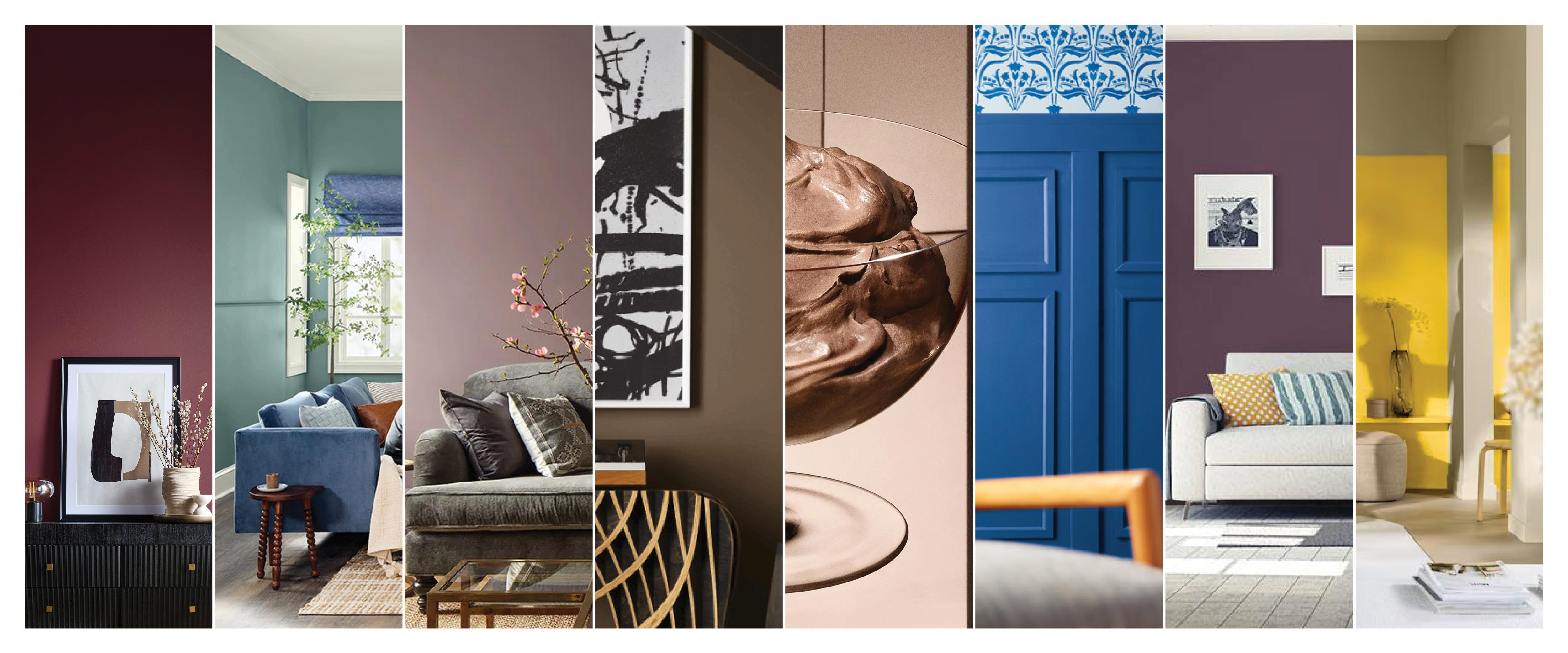
Pantone’s Color of the Year for 2025 is a soft, warm brown color called “Mocha Mousse”. This tone aligns with the trends for furniture and home design leaning more minimalist and neutral, giving people more diversity in their ability to design and decorate their homes. Warm brown tones evoke feelings of nature, wood and wood grain, and earth. This can inspire feelings of security and comfort, which is perfect for a home. Complementary colors can range from a cool green to a powder blue. Monochromatic colors are a grey-brown in a similar tone, and a darker, more rich brown. Triad colors push the complementary colors further into a more yellow green and lavender.

Sherwin Williams followed a similar path in the warm neutrals this year, but rather than selecting one color of the year for their 15th Color of the Year anniversary, they chose a palette of nine colors in a Color Capsule of the year. Two of the colors chosen, “Grounded” and “Malabar”, are warm neutral brown colors in a lighter and darker tonality than Pantone. Just like with Mocha Mousse, Grounded and Malabar are colors that are easy to pair with a wide variety of other colors in home décor and design.

Five of the other color selections from Sherwin Williams live in the same warm neutral category. However, the large outliers are “Rain Cloud” and “Mauve Finery”. This slate blue and soft lilac do certainly follow color trends but vary drastically from the warm neutral trend. Blues and blue-greys have made a large growth in popularity in the last few years, especially in kitchen and bath cabinetry.

Benjamin Moore follows suit by taking the neutrals down a slightly purple path with “Cinnamon Slate”. This warmer shade of mauve dances between the earthy warm brown tones while inspiring a luxurious feel by pushing into a purple range.
PPG takes the purple tone one step further with “Purple Basil”, a rich and regal shade of purple. This darker but equally striking color complements well with an olive or soft forest green. A monochromatic palette blends a lighter mauve and a striking pink, while a triadic palette leans more towards teal and hazelnut.


Sherwin Williams is not the only company that leaned into the blue spectrum. Valspar’s “Encore” strikes the eye in a bright cobalt color. Blue shades are often considered peaceful, calm, and relaxing. It inspires visions of a clear sky, a breezy beach, or a cool swimming pool. Blue can evoke creativity or help encourage meditative practices and thoughts. Dutch Boy also brings the beach to the home with “Mapped Blue”, a light cadet blue shade that feels like cool ocean water brushing a sandy shore. These blue colors complement warm, earthy tones like a rust brown or mustard yellow. A monochromatic palette leans darker into slate greys and dark navy blues. Triadic combinations lead you into lime and poppy red territory.


The largest two outliers this year are Behr and Akzo Nobel, coming in with a striking red and bright yellow.
Behr’s “Rumors” is a muted wine red that, very much like Purple Basil, is complemented by warmer and cooler shades of green. A monochromatic palette with Rumors features a soft taupe pink and a bright bubblegum pink, while a triadic palette leans towards teal and olive. The color red is known to stimulate metabolism, increase heart rates and is associated with excitement and passion. Utilizing this bold red can add energy to any space but is best used as a strategic accent.
“True Joy” really is an apt name for this bright, sunshine yellow from Akzo Nobel. Yellow is a color often associated with happiness and joy, but the color is also a drain on the eyes. Because yellow is such a bright and light color, it reflects a large amount of light, and that can quickly cause eye fatigue. Just like red, yellow tones are best used strategically, as not to overwhelm a space or strain the eyes.


Now you might be thinking to yourself that this is not necessarily relevant to what your company does in this industry. But I pose this to you: If customers start looking for these colors in paint, furniture and fabrics for their homes or offices, will your products work well with them? It’s important to consider how the products you produce will work well with future colors and designs customers may seek out. It’s important to be aware of color theory and be prepared to showcase products that will suit the customer’s needs. Being knowledgeable on how colors work well together shows your customer that you are staying on top of trends and are ready to help them utilize your products and knowledge.


Have something to say? Share your thoughts with us in the comments below.