Many major paint companies have made their picks for 2019 Color of the Year. Here’s a look at the colors and trends that will impact residential interiors.
2019 color trends for panels and interior finishes are expected to include earth tones, a continuation of textured looks and an influence of nature. Also, greens, blues and grays remain strong as well as a mix of metallic accent finishes.
Following are several of the major interior paint manufacturers predictions for 2019 Color of the Year:
Described as a warm terracotta color with ancient, elemental roots, Cavern Clay is Sherwin-Williams’ 2019 Color of the Year. The choice, which is SW 7701 in the Sherwin-Williams color catalog, is a nod to Mid-century Modern style, but with the soul of the American Southwest, which together create the desert modern aesthetic.
“We believe 2019 will be a renaissance of the 1970s—with a twist. In the coming year, we will embrace our pioneering spirits and artisan ingenuity,” says Sue Wadden, director of Color Marketing at Sherwin-Williams. “Our 2019 Color of the Year, Cavern Clay, embodies renewal, simplicity and free-spirited, bohemian flair.”
Cavern Clay, a part of the Wanderer color journal that was announced earlier this year in Sherwin-Williams’ 2019 Colormix Color Forecast, is recommended as a choice for residential and commercial settings.

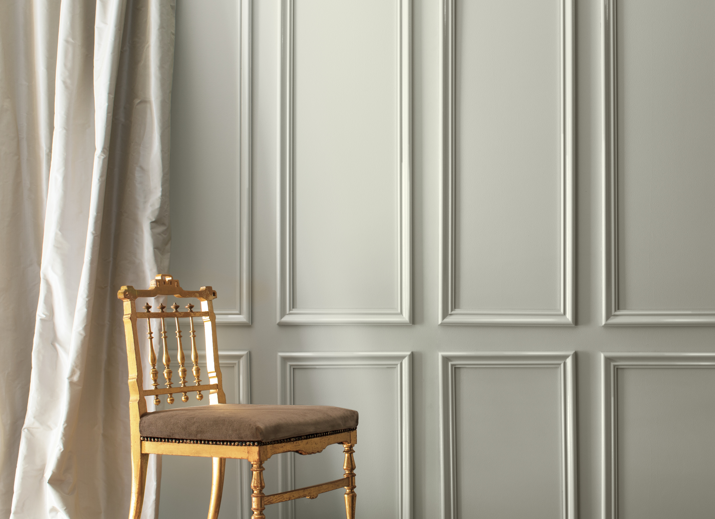
Benjamin Moore chose Metropolitan AF-690, a stylish gray with cool undertones, as its 2019 Color of the Year.
“Comforting, composed and effortlessly sophisticated, Metropolitan AF-690 exudes beauty and balance,” says Ellen O’Neill, Benjamin Moore director of Strategic Design Intelligence. “It’s a color in the neutral spectrum that references a contemplative state of mind and design. Not arresting nor aggressive, this understated yet glamorous gray creates a soothing, impactful common ground.”
Benjamin Moore also unveiled its Color Trends 2019, a corresponding palette of 15 harmonious hues that further amplify the cultured grace of Metropolitan AF-690. The colors range from ethereal neutrals to frothy pinks, to rich blues and greens.

AkzoNobel unveiled Spiced Honey as its 2019 Color of the Year. The warm amber tone is being marketed in the company’s decorative paint brands, including Dulux, Coral, Levis and Flexa.
The company said the shade was selected following expert research into global trends, insights and consumer behavior. According to AkzoNobel, Spiced Honey is a versatile, contemporary choice, and complements a wide variety of lifestyle and interior design preferences. It also expresses the new sense of optimism felt throughout the global trend research that was carried out.
“The reveal of Spiced Honey is another milestone in empowering consumers worldwide to choose paint colors with absolute confidence,” says Heleen van Gent, creative director of AkzoNobel’s Global Aesthetic Center. “It’s a color that can be calming or nourishing, stimulating and energizing, depending on the light and colors surrounding it.”

Dunn-Edwards chose Spice of Life, a dark, fire brick red with orange undertones, as its 2019 Color of the Year.
“Spice of Life is an outgoing, confident hue that adds drama and stimulates the senses,” explains Sara McLean, color expert and stylist for Dunn-Edwards. “It’s a celebration of what makes life interesting and exciting. Spice of Life makes a bold statement with a melding of diverse and global influences.”
McLean says the company selected Spice of Life after extensive research on color trends in everything from art, hospitality, and fashion to global events and local street culture. “In these always-connected times, we start to crave real, genuine connections with the earth and with each other,” McLean explains.
“These feelings are reflected in a movement away from cooler hues toward more earth-inspired color reminiscent of Naturalist motifs, Bohemian moods, the great American West and an anticipation of exploring the red planet, Mars. These organic, autumnal and life-affirming hues, such as Spice of Life, are strong, authentic and full of humanity.”

Behr Paint selected Blueprint S470-5 as its 2019 Color of the Year. It’s a mid-tone blue that’s warmer than denim and softer than navy.
This refined blue signifies authenticity, confidence, and timelessness, the company says. “Much like the sketches builders rely on to bring an architectural design to life, Blueprint S470-5 lays a foundation for consumers to make their unique vision a reality,” says Erika Woelfel, vice president of color and creative services at Behr.
“This universally appealing hue provides a steady stream of positivity and is poised to be an instant classic for years to come.”

PPG’s 2019 Color of the Year is Night Watch (PPG1145- 7), which it says is a rich, luxurious, and classic shade of green allowing spaces to emulate the feeling of lush greenery and the healing power of nature. Night Watch’s versatility allows the paint color to be used in a variety of rooms and design segments – from healthcare to commercial and residential design.


Have something to say? Share your thoughts with us in the comments below.