Color choice can influence not only the aesthetics of a healthcare facility, but its integration in the setting also can impact and enhance the care and healing of patients in different age groups.
“The Application of Color in Healthcare Settings,” an October 2012 study sponsored by KI and Jain Malkin Inc., examined these and other issues while offering some design considerations. Authors of the study were: Sheila J. Bosch, PhD, LEED AP, EDAC, director of research and innovation for Gresham, Smith and Partners; Rosalyn Cama, FASID, EDAC, president and principal interior designer of planning and design firm CAMA, Inc.; Eve Edelstein, MArch, PhD, EDAC, AssocAIA, F-AAA, founder and president of Innovative Design Science; and Jain Malkin, CID, AAHID, EDAC, president of Jain Malkin Inc.
While noting a “lack of consensus in the literature of color in healthcare settings,” the authors offer a number of considerations for the design process.
Age Preferences & Considerations
Saturated colors versus pastels, and use of contrasting colors is often recommended for areas with elderly patients who may have trouble distinguishing colors, spatial relationships and tones, the study reports. It also cites research by Dittmar (2001) of a decreased preference for blue among elderly patients.
Excessive amounts of white also are not recommended in areas highly used by older patients. White corridors in conjunction with white floors, for example, “can create a visual hazard for older persons with reduced visual acuity and even other patients with compromised equilibrium, which could lead to falls,” the study notes.
Often perceived as an institutional “color,” white also was least preferred by pediatric patients, who otherwise expressed no distinct color choice (Park 2009).
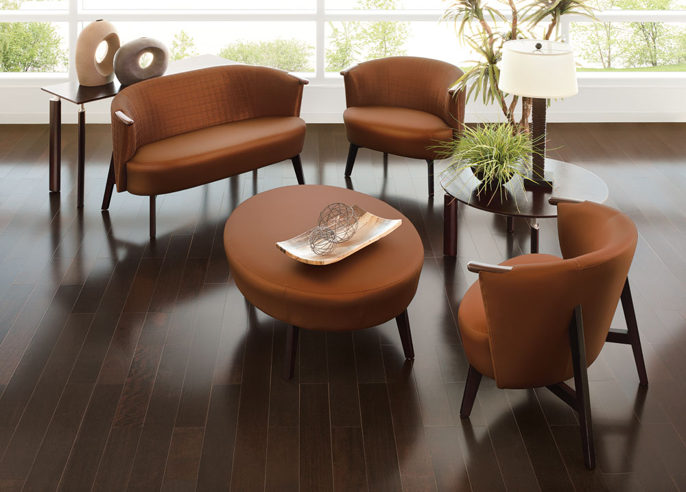
Adding color via furniture or in a design can make the environment less intimidating. However, too much of the same color in one setting is not recommended. Citing research by Mahnke & Mahnke (1987) that it can result in sensory deprivation, the authors note, “A variety of colors is essential because an individual quickly adapts to the effects of any one color, no matter how predominant, and it becomes monotonous.”
Ways in which to reduce the monotony and institutional feeling of the healthcare environment include using combinations or “harmonies” of: complementary colors, split-complements, a triad color scheme (formed by three equally spaced colors on the wheel), analogous colors (adjacent to each other on the color wheel), and a tetrad color scheme (four colors equally spaced on the wheel).
Function & Color
In choosing a palette, keep in mind the area’s function as the color used in the furniture and other surfaces can “reflect” onto the patient. For example, the study reports, yellow or blue surfaces could make a visual diagnosis of jaundice, cyanosis or other diseases difficult.
Those designing for healthcare environments also should take into consideration how and by whom the space is used.
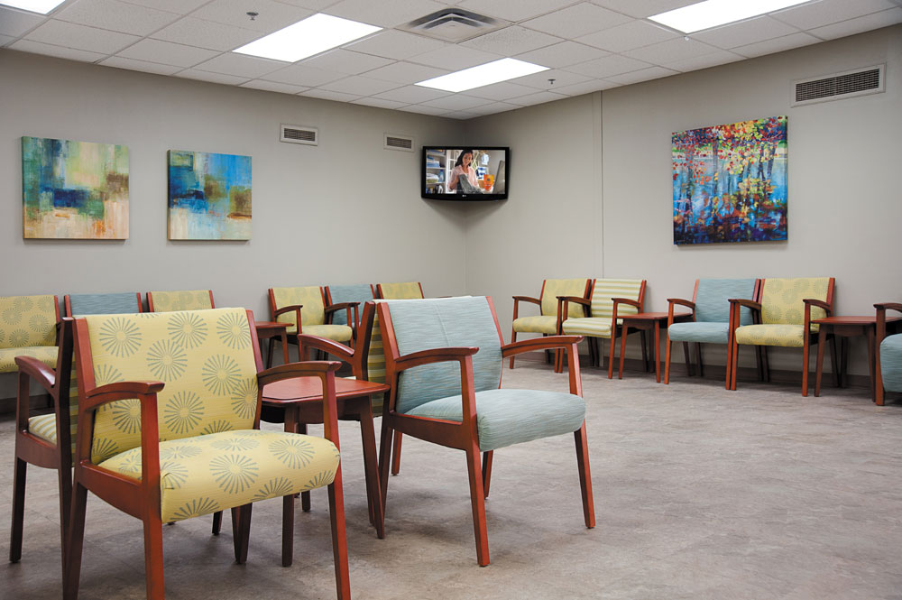
Warm colors such as red or orange, while encouraging “increased alertness and outward orientation” can also make time seem to pass more slowly than cool colors, making it less than ideal for waiting rooms.
Cool colors such as blues or greens, along with low illumination, also “neutralize the negative effects of noise distraction,” the study says, making it easier to concentrate on difficult tasks (Sharpe 1974).
Agitated or hypersensitive patients also do better in areas predominated by cool colors, whereas red is suggested for depression-diagnosed environments.
Red however, is discouraged for use in settings used by those with epilepsy or other neurological diseases (Sharpe 1974.)
Extremely bright colors, as well as contrasting figure-ground patterns also should be avoided in rooms used by psychotic patients who can find them intimidating or overwhelming, according to the study.
Cultural & Geographic
There can also be a geographic and cultural bias when it comes to color selection.
For example, warm colors and species are often “more appropriate” in Northern climates with cold weather, while tropical areas trend toward saturated colors.
On a cultural level, the different connotations associated with a color can effect its usage in the design selection process.
In the United States and Canada, for example, red is associated not only with energy and courage, but also with violence. In Mexico, red is also symbolic of both religion and death,
The color green, while reflective of nature and money, is also associated with inexperience and envy. Yellow, while considered a happy and warm color, also has connotations of cowardly. The basic brown stands for “natural, solid, reliable, yet dull and unsophisticated.”
And gray, which is a perennial favorite for cars or to symbolize high tech, is also “associated with gloom and ranks poorly in terms of consumer preference.”


Have something to say? Share your thoughts with us in the comments below.